My Role:
Sole UX Designer
Duration:
4 weeks
Overview
Tools:
Figma, Canva, Procreate, Google Survey
Client:
Level Up Startup
Level Up is a mobile and web app to help people to be become mentor or mentee in their desired field, provides 1:1 coaching, and team discussions. Level Up is a startup founded to make the connection between mentors and mentees easier around the world.

Students and people at the start of their careers need advice from experts and professionals in their chosen fields. It is important to have a trusted platform where mentors are certified and willing to accept mentees. The process of finding a mentor is tedious for most cases.
The Problem
A mobile and web app where students and people at the start of their careers can find professionals in their desired fields around the globe virtually and in-person.
The Solution


Design Process
Research
Quantitative
I did a survey using google surveys and received 21 responses involving various ages and gender groups. The qualitative research was interviewing 2 people consisting 1 student and 1 professional.
Qualitative
Here are some quotes from participants during the interview.
User Persona
The information acquired during the empathize phase is analyzed based on the personas and empathy mapping. User journey helped me to create a customer-centered approach.
Empathy Map
User Journey
User Journey is used to find out the user’s perspective of the product. After having personas and empathy mapping, I could create the user journey map which helped me to know better the user in every stage of using my product.
Mentee
Mentor
Questions were framed based on the problems that need to be solved.
Make a comfortable space for users
Provide mentors and mentees to find a good match
Customize the app based on the users’ interest
Enable both mentors and mentees to take notes of the meeting
Reminding both mentors and mentees about their sessions
How might we?
For Level Up it was decided to create user interactions for every stage and see how they can explore in different stages.
User Interactions
Wireframes
All the insights obtained in the previous stages are used to create a tangible product that could be tested by users. Started with low fidelity prototypes and wireframes to high-fidelity prototypes.
Style Guide
Onboarding and Log in
The first interaction with the user is made easy and quick. The onboarding process asks a few questions to personalize the content. (Mandatory and optional).
High Fidelity Prototype
Home
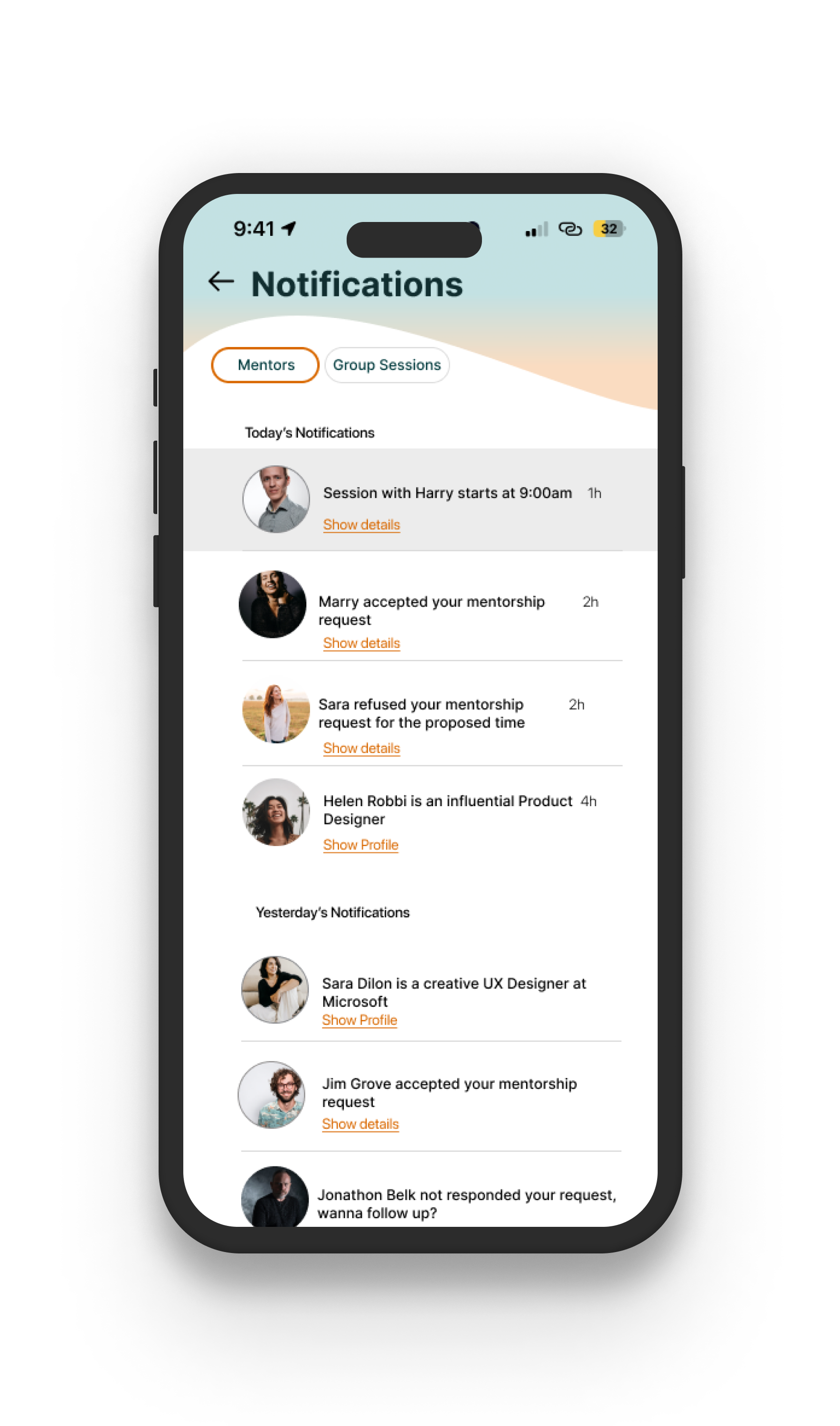
Home provides customized recommendations and other customized artifacts such as today’s sessions, calendar and notification.
Search
Search for mentors, sessions, job college, companies and more.
Book a session
This is the most important part of the application. The user first checks the mentor’s profile and then book a session after going through three steps of the booking. when request is made, the user will be notified about the answer of the mentor once they approve or reject.
Network
The first interaction with the user is made easy and quick. The onboarding process asks a few questions to personalize the content. (Mandatory and optional).
More Screens
With the prototype ready I conducted a moderated user testing session with 5 people for 30 minutes. As a result of testing, the app needed few improvements.
Before
After
lack of a back navigation made it difficult for users to make any edit in their previous information entered.
The setting button was not easy to find for users so it was put on the top right of the profile screen.
Users wanted to have an option of sharing files and images in the chatroom with mentors.

Reflection:
Designing Level Up was a passion of mine. The need for mentorship is obvious among people who want to make decisions for their career or educational purposes. The key learnings are as follows:
Every single part of the app design should be based on the data received during the research.
The usability test is a crucial part of the design and no matter how happy we are with the design, users might see it differently.
The need for accessibility has to be considered during the design such as contrast of the colors, size of the text and icons, and clear navigation.
Next steps:
A design is never finished and we need to keep updating and upgrading the design based on the user’s need. Other screens for expansion of the app is needed.
Premium features will be the next stage of the design.
Avocado
Other work
Moon Beam
UX/UI Designer | A mobile app as an all-in-one place for expecting and new parents to take care of themselves and their little ones.
UI/UX Designer (Team of 2) | A responsive website design for a vegan bakery.
Nova
UX Lead (Team of 3) | A Business Management Saas platform responsive web application for businesses worldwide.


