Nova
Project Overview
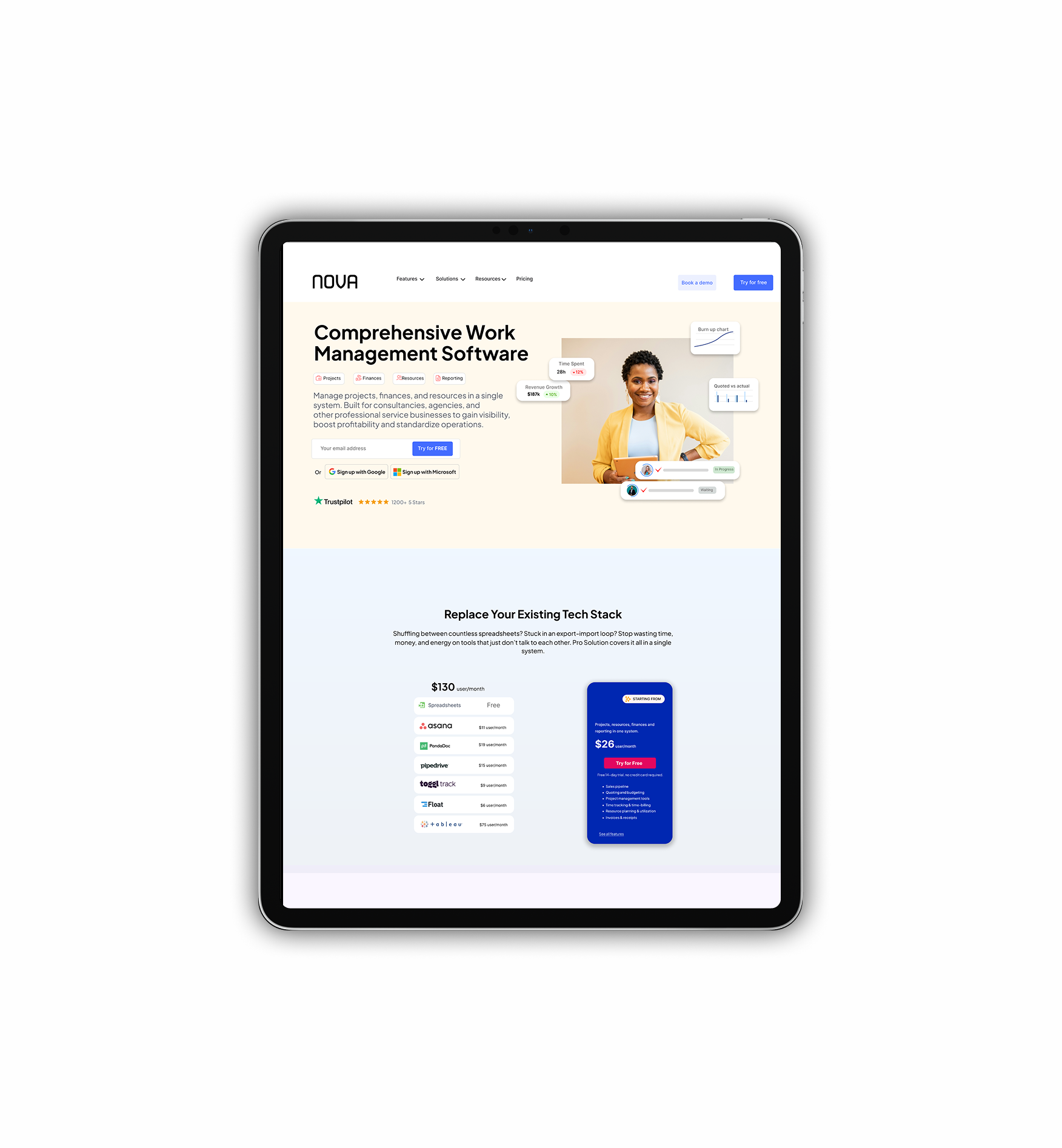
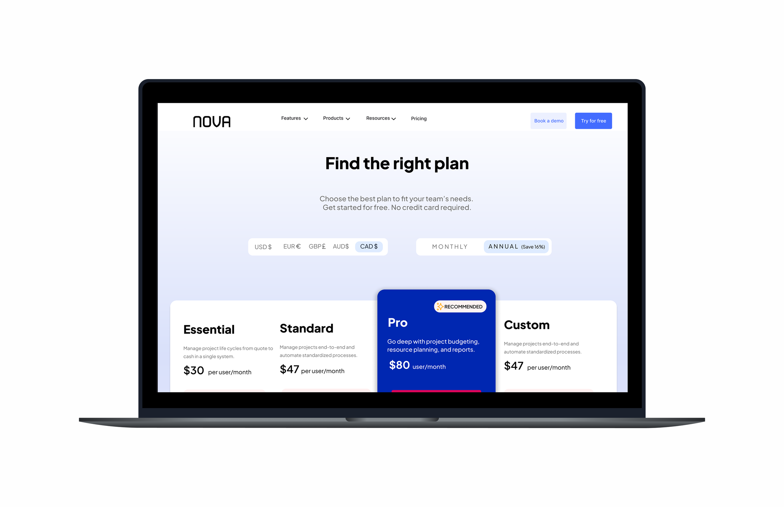
NOVA is project management software that delivers quality work on time and manages everything in one place—from clients and projects to invoices and financial reports. The goal of the project was to design a Responsive Website in a competitive market and raise the conversion rate.
Impact:
Based on the information that Nova reported to us 4 months after the launch of the new web app, the following impacts of the project can be listed:
App rating went from 3.8 to 4.8/ 5 starts
34% increase in user engagement
Average time spent in the web app increased by 210%
Problem:
When we received this project, a basic UX and UI design had been done. However, the client had no definitive branding or working process. They needed the UX design team to craft this concept from the ground up, create a responsive web application (Desktop, iPad, and Mobile), and ensure the interactions and flows are seamless, intuitive, and visually pleasing.
The client had not architected any of the features or explored exactly what should be included. The product would focus on providing business management services through the SaaS Platform.
Solution
Nova provides affordable and reliable services worldwide. It is a software-as-a-service solution for professional and creative services. The all-in-one business management software combines project management with time and team management, sales, billing, and professional services automation.
We developed a responsive web application (Desktop, iPad, Mobile) for this Saas platform, where the user can book a Demo, and learn about all the services and business management solutions.
My ROLE
Lead UXUI design in team of 5
PROCESS
Research
User Flow
Wireframes
HiFis
Developer Handover
TIMELINE
Overall 5 weeks
Research and discovery 1 week
Design and Iteration 4 weeks
TOOLS
Figma
FigJam
Zoom
Google Docs


Kickoff
As the project's design lead, I set up a quick Zoom meeting so the team could introduce themselves, go over the client's brief, ask any questions, and go over deliverables and milestones. We spoke about our first ideas for the user flows throughout the call, and I gave each designer a user flow to present at the following meeting. I also made a document that the team could use to compile any queries they might have had for the customer. This strategy made sure that everyone understood our objectives and that we were communicating clearly from the beginning of the project.
Client Questions
I asked every team member to carefully review the project materials and think through any questions about the product or its interactions to build a solid rapport with the client. After that, I combined all of these inquiries into one document and gave it to the client, making sure that all of their worries were taken care of. To aid with judgments on layout and content, as well as the specifics of what data is required for an initial account onboarding, we needed to establish the target audience. These important insights helped us to become more clear:
The target audience is business owners and Project Managers.
The current website is complicated and cannot guide clients well.
Onboarding needs to prompt the user for their goals and an option to cancel
User should be able to see the feedback and reviews of the services on all the pages
Ideation
User Stories
User stories most vital to the MVP for the client were submitted to the project manager. These involved some of the basic functions of the web application. Further development would be built on the foundation we set.
As a user, I want to be able to get all the basic information about the software services before signing up.
As a user, I want to be able to choose what aspects of business management I need and which ones I don’t.
As a user, I want to be able to log in to my account from all devices.
As a user, I want to be able to clear my data and re-enter.
User Flows
With the established user stories as a guide, the team developed the user flows by initially working individually, and later presenting and iterating on them in group sessions. The objective was to deliver each user story in the most streamlined and intuitive manner possible. I was responsible for creating user flow 2 - "As a user, I want to be able to create my own account".
Design
Wireframes
In the first round of medium-fidelity wireframes, I assigned wireframes according to the user flow the team member previously worked on. Since this application was a responsive design, I made sure to have the team start with screens for mobile first, before designing for the desktop versions. We explored several iterations for each user flow and presented them back to the team in work sessions to ensure consistency and alignment on a singular point of view and voice.
Style Guide
After collaborating on UI and color inspiration, our team aligned and established a functional color palette. We then proceeded to define and fine-tune the remaining brand attributes.
I assigned the task of researching potential fonts for the wordmark to a designer with a lighter workload. I provided them with a tool to expedite the process and they subsequently presented me with their findings, including screenshots of all potential fonts with the wordmark. After sharing this with the group, we ultimately agreed on Inter for its slightly wider and rounded curves, which complemented the UI elements. Over the following weeks, we continued to refine the style guide, specifying details such as grids for desktop and mobile, iconography, illustrations, components, buttons, input fields, and navigation. As the lead, I facilitated discussions on the type scale and worked closely with each designer to ensure its seamless integration into their respective flows and overall cohesiveness with the design language.
Handoff
Developer and Client Handoff
As we waited for the client's feedback on the HiFi screens, I initiated work on the developer handoff. Each designer took responsibility for their own workflow and employed a plugin called Measure to annotate the screens for the developers to follow. This was done to ensure that all spacing and padding were accurate, and that interactions were clearly described to avoid any ambiguity about how certain actions were executed in a user flow. Designers also annotated interactions between screens to ensure the developer and client understood the actions that led to interface or screen changes.
Avocado
UX/UI Designer | A mobile app as an all-in-one place for expecting and new parents to take care of themselves and their little ones.
LevelUp
Sole UX Designer | Design of a responsive web application for a startup to make connections between mentors and mentees worldwide easier.
Moon Beam
UI/UX Designer (Team of 2) | A responsive website design for a vegan bakery.


